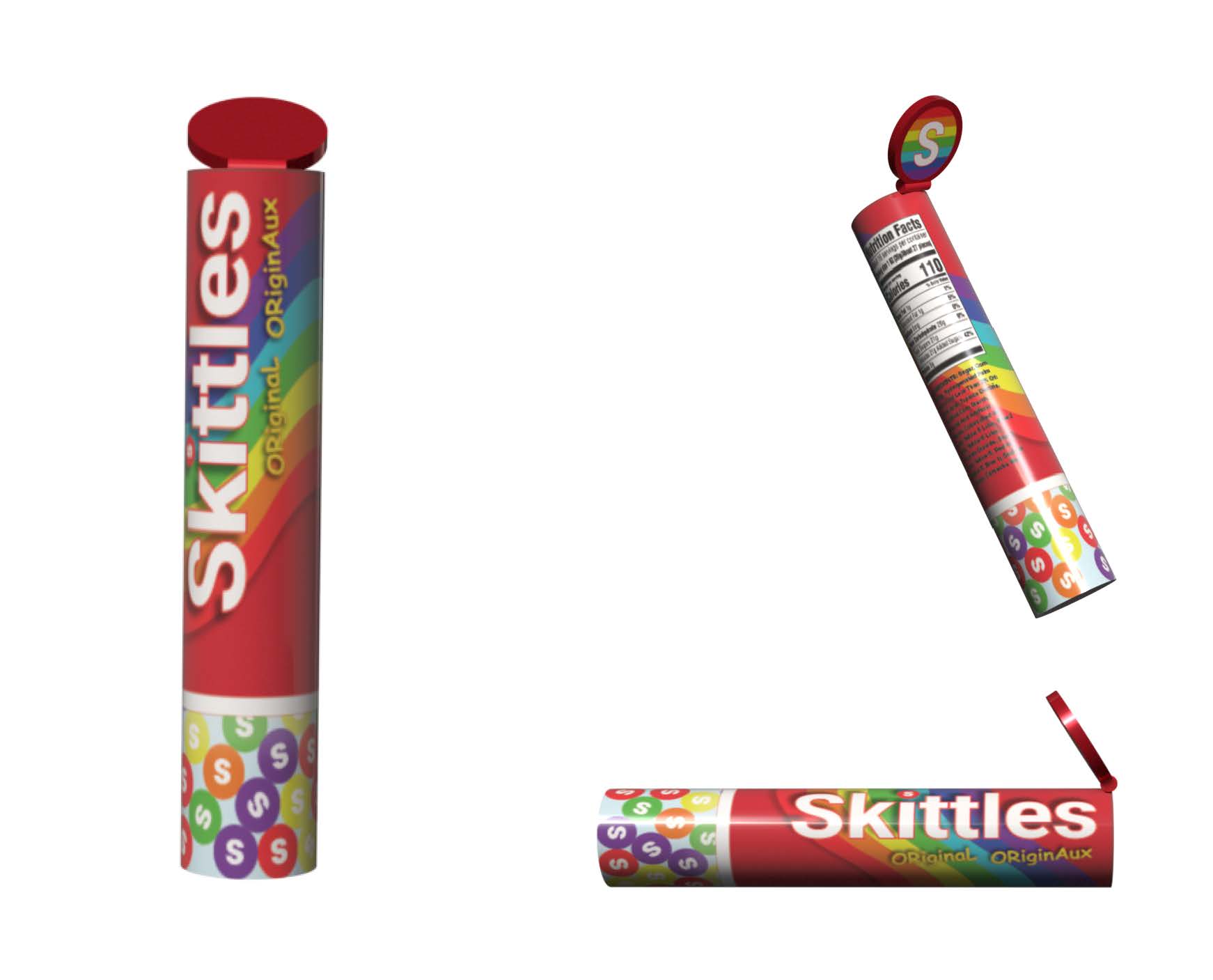
This project focused on redesigning the packaging for Skittles by transforming the traditional plastic bag into a reusable hard plastic tube container with a pop-up resealable lid and transparent lower section. The redesign aimed to improve portability, durability, storage efficiency, and overall user experience while maintaining recognizable brand elements through the signature rainbow wave graphics and bright colour palette.
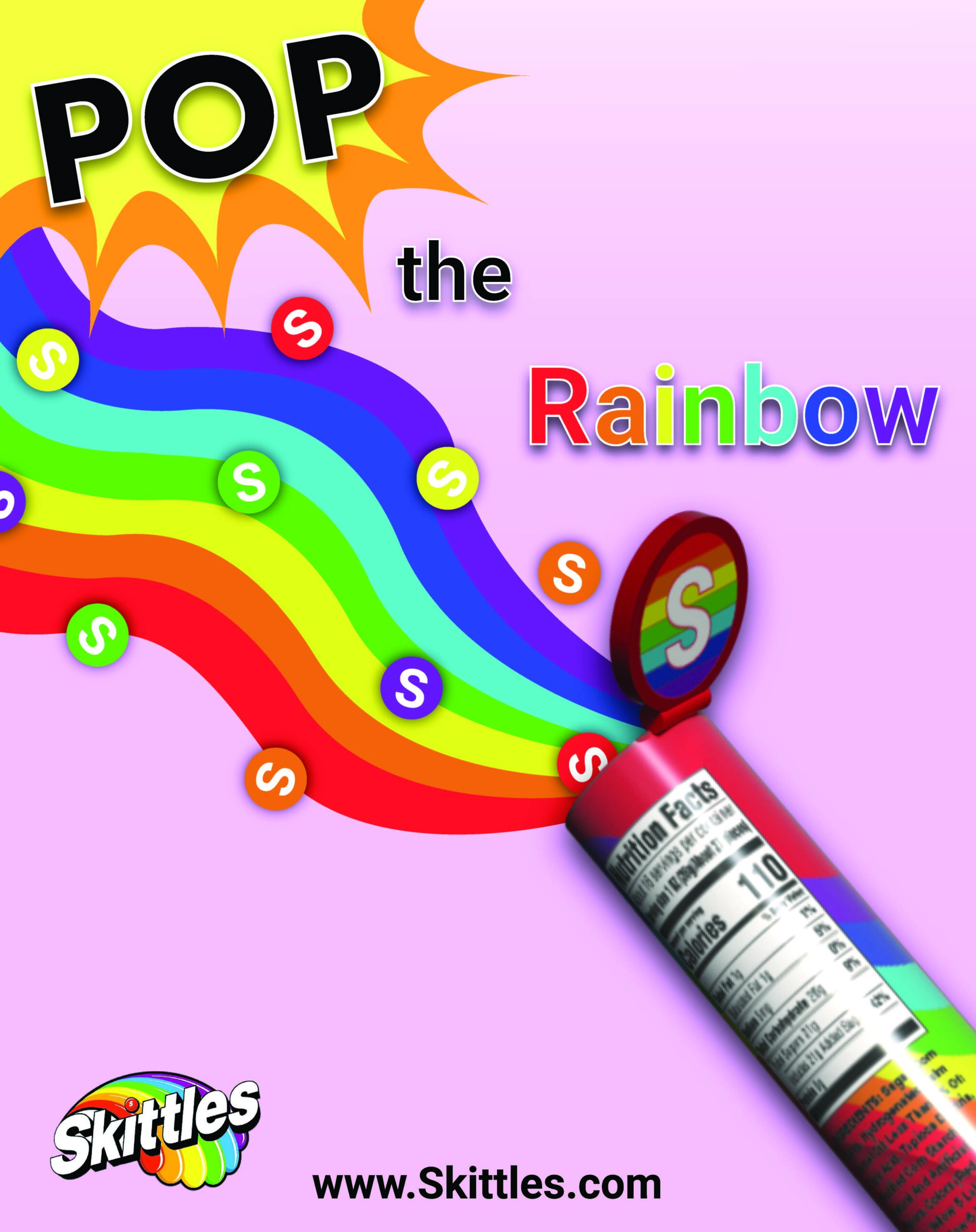
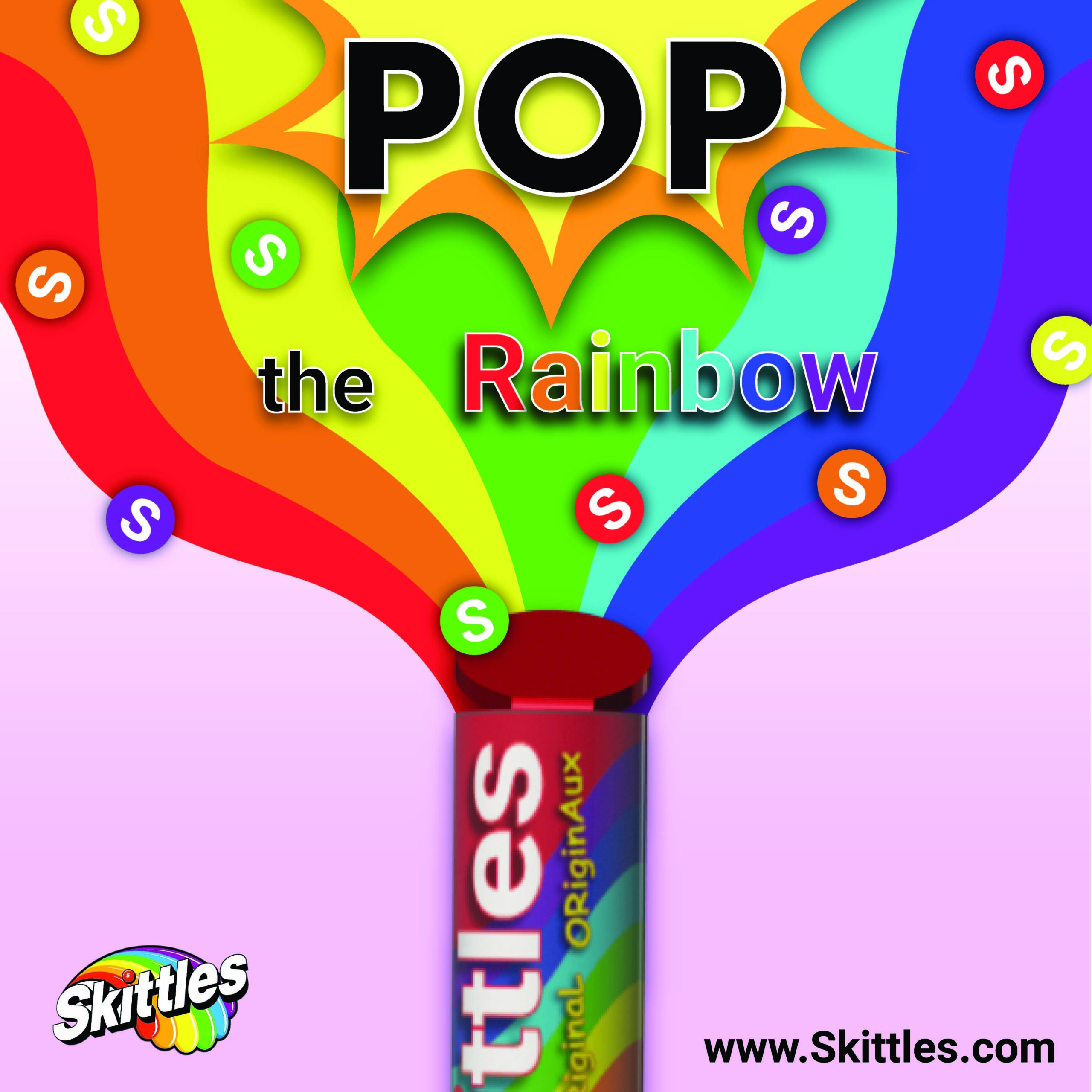
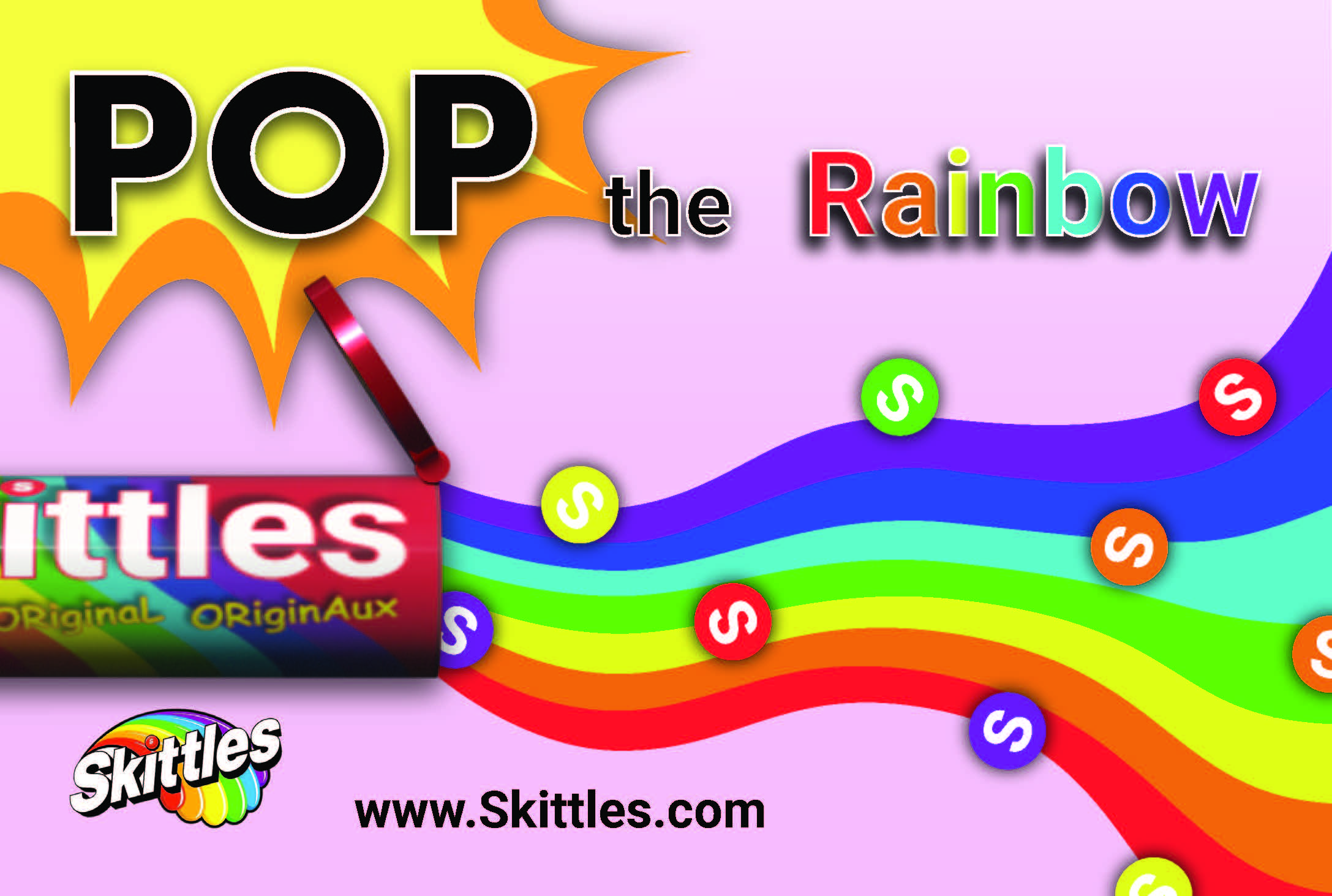
To support the redesigned packaging, I created the custom slogan “Pop the Rainbow,” referencing the pop-up lid mechanism used to access the candy. The transparent lower section allows users to easily view the remaining product, while the resealable cylindrical structure improves freshness, portability, and shelf organization.
Alongside the packaging redesign, I created promotional advertising applications for Instagram, Facebook, and print media. Each application expanded on the colourful visual identity of the packaging through flowing rainbow graphics, playful composition, and bold typography to create a cohesive campaign across both digital and print formats. This project focused on packaging design, branding consistency, advertising design, and creating functional product experiences supported by a unified visual campaign.